What are you looking for?
Ixia, a Keysight Business, is now Keysight
Connect and Secure your Network with Keysight
Digital transformation requires the deepest insights from your network. Pressure test your infrastructure at scale with simulated traffic, validate security with breach and attack simulation, and gain visibility into every packet. Safe, reliable, and responsive networks rely on Keysight.


Digital Transformation is Driving Big Changes in Your Network
With many of today’s applications moving to virtualization, it's never been more challenging to build, secure, and manage hybrid networks. Cloud, edge, and SD-WAN are transforming your network, but making it harder to ensure security compliance and a consistent user experience. Between evolving applications, increased security threats, and changing service models, it’s tough to keep up.
Your network needs a source of truth — before, during, and after deployment. With a complete portfolio of test, visibility, and security solutions, companies trust us to future-proof their networks throughout their entire lifecycle.
Enterprises, service providers, government agencies, financial institutions, and networking vendors worldwide trust us to help build and manage their networks, including:
77
of the Fortune 100
15/15
top networking vendors
10
top global exchanges
47/50
top service providers
100+
federal organizations
5/5
DoD services
400+
financial markets
38/50
top banks
Discover Keysight's Network Solutions
Ensure High-Performing Networks and Applications
Whether you're manufacturing network equipment or designing your own network, you need to build for optimal performance and compliance. That means testing your network in hybrid environments against a range of protocols, traffic patterns, and application workloads. It’s not easy, but the up-front work won't just pay dividends in satisfied users and proven performance; it's more cost effective as well. After all, bugs found before deployment are 90–100 times cheaper to fix than those in production.
Keysight can help. We offer a wide range of network test solutions for today’s most demanding network architectures.


Understand What's Happening on Your Live Network
Your production network is one of your most valuable strategic assets. You need to innovate continuously, meet aggressive service level agreements, and keep everything running smoothly and securely. That means capturing deep insights into network traffic, applications, and user experience across your entire network environment — enabling you to eliminate blind spots, increase efficiency, and get the right data to the right tools at the right time.
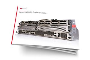
Keysight can help. We offer a wide range of network visibility solutions to help you better connect and secure your network by monitoring and responding to network and security issues on your network.


Test Your Network Security by Hacking Yourself
Security is never static. New threats are ever-present, and misconfigurations can compromise your network in an instant. While it may sound counterintuitive, you need to hack yourself — before someone else does. By safely simulating the latest attacks on your production network, you can definitively measure risk, expose gaps, and course-correct with step-by-step remediations.
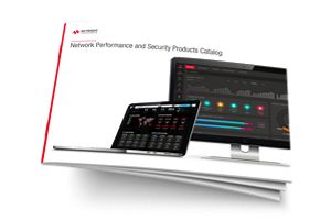
Keysight can help. With our network security solutions, you can continuously validate your defenses, reduce your attack surface, and prove you’re safer than you were yesterday.


Deliver the Best Possible User Experience
Your network team supports a broad range of applications (including unified communications, VoIP, and video) — all with varying degrees of sensitivity to latency and loss. But when it comes to monitoring performance, passively waiting for live network data is not enough. If you want to find connectivity issues or performance problems before your subscribers do, you need to be proactive.
Keysight can help. With our performance monitoring solutions, you can minimize downtime by continuously testing, validating, and monitoring quality of service — from your centralized applications to your users on the network’s edge.


Find the Solution That's Right For Your Industry
Find a Partner That’s Right for You


Want help or have questions?